
25 Jun Top Tips for Designing Effective Aluminium Composite Panel Signage
Table of Contents
You want your aluminium composite panel signage to stand out and last. Clear, attractive, and durable aluminium composite panel signage increases brand impact and draws more attention. When you use easy-to-read fonts and strong color contrast, you make sure people see and remember your message. The right design choices help your aluminium composite panel signage stay visible and readable over time. If you understand your audience, you can create aluminium composite panel signage that works in any setting.
Many shoppers report having trouble finding businesses because of unclear signs. When you understand your audience and use effective aluminium composite panel signage, you boost your brand’s visibility and help customers find you.
Key Takeaways
- Keep your signage design simple and clear to help people understand your message quickly and remember your brand.
- Use high-contrast colors and easy-to-read fonts to make your sign visible and legible from a distance.
- Choose durable aluminum composite panels with protective coatings to ensure your signage lasts longer and stays bright.
- Plan your sign placement and size carefully to improve readability from different angles and distances.
- Test your design with proofs and gather feedback to avoid mistakes and create signage that works well for everyone.
Design Tips for Aluminium Composite Panel Signage
Simplicity
You want your aluminium composite panel signage to deliver a clear message fast. Simple designs help people understand your message quickly. Research shows that people recognize simple shapes, like bars, faster and with fewer mistakes than complex ones. This means that when you keep your signage simple, you reduce confusion and help viewers remember your brand. Use whitespace to guide attention to the most important parts. Try the 3×5 rule: three lines of text, five words each. This keeps your message short and easy to read. Pairing a bold headline with a strong image can boost memory retention by up to 400%. When you avoid clutter, you create a unique aesthetic that stands out in busy places.
Tip: Remove extra words and jargon. Focus on one clear idea for each sign.
Contrast & Color
High contrast makes your signage easy to read from a distance. Studies show that luminance contrast, like black text on a white or yellow background, improves legibility more than color choice alone. Accessibility guidelines recommend a minimum contrast ratio of 4.5:1 for normal text. This helps everyone, including people with visual impairments, read your message. You can use tools to test your color and finish selection before printing. A good finish not only boosts readability but also adds to the aesthetic appeal of your aluminium composite panel signage. Choose colors and finishes that match your brand for a cohesive look.
Typography
Choose fonts that are easy to read. Sans-serif fonts work best for aluminium composite panel signage because they stay clear at different sizes and distances. Large, bold letters help your message stand out. Limit the number of fonts to keep your design clean. Good typography, paired with the right finish, makes your signage look professional and supports your brand’s unique aesthetic. These acp panel design tips ensure your signage remains effective and attractive.
Remember: Consistent typography and finish help your signage look polished and trustworthy.
Graphics & Branding

High-Resolution Images
You want your signage to look sharp and professional. High-quality graphics make your message clear and easy to remember. When you use high-resolution images, you avoid blurry or pixelated signs. This helps people trust your brand and understand your message faster. You can use photos of your products, your team, or your results to add meaning to your signage and branding. Charts, graphs, and tables should always be crisp so viewers can read them from a distance.
Avoid generic or low-quality images that do not add value.
Use captions and labels to explain images and reinforce key points.
Make sure your visuals match your brand style and colors.
Simple layouts help people focus on your main message.
You should also check that your images stay clear on different screen sizes and from different viewing distances. For outdoor signage, choose weather-resistant materials and high-brightness displays to keep your message visible in all conditions.
Consistent Brand Elements
Consistent brand elements help people recognize your business right away. When you use the same colors, logos, and fonts across all your signage and branding, you build trust and make your space more memorable. Studies show that using consistent brand elements in aluminium composite panel signage leads to big improvements in how people see your brand and how they act.
Impact Metric | Measurable Result |
|---|---|
Positive brand associations | |
Brand recall | 45% increase |
Employee satisfaction | 38% increase |
Customer dwell time | 25% increase |
Conversion rates | 30% increase |
Maintenance cost reduction | Up to 45% decrease |
Space memorability | 60% increase compared to traditional |

When you keep your signage and branding consistent, you help customers remember your business and feel more comfortable in your space. This can lead to more sales and happier employees.
Viewing Distance & Angles
Readability
You want people to read your signage easily, no matter where they stand. Research by Cai et al. (2013) shows that both viewing distance and angle have a big effect on how well people can read signs. They found that legibility stays strong up to an angle of about 65 degrees. If someone views your sign from a sharper angle, it gets much harder to read. The study also gives formulas to help you pick the right letter size for different distances and angles. When you plan your signage, always prioritise readability. Make your letters large enough for people to see from far away. A driving simulation study found that increasing the space between letters helps people read signs from longer distances. Drivers could spot words sooner and respond faster when the letters were spaced out. This means you should use clear fonts and enough spacing to help everyone read your message quickly.
Tip: Test your sign at different distances and angles before finalizing your design. Ask others to read it from across the room or down the street.
Placement
Good placement makes your signage more effective. You need to think about where people will look and how they move through a space. Studies using virtual reality and Building Information Modeling show that sign placement, angle, and distance all affect how well people find their way. The table below shows some key guidelines for planning your sign placement:
Guideline Aspect | Description | Supporting Evidence |
|---|---|---|
Isolation of Signs | Place signs where there is little visual clutter, at eye level. | Reduces distraction and improves attention. |
Reassurance Signs | Add extra signs along routes to confirm the correct path. | Helps people feel confident and reduces confusion. |
Distinctiveness | Make signs stand out from the background and other signs. | Older adults rely on clear cues; distinct signs help everyone notice them. |
Consistency and Simplicity | Keep signs looking similar and uncluttered. | Simple, consistent signs are easier to see and remember. |
Strategic Placement on Landmarks | Place signs near, but not on, important landmarks. | Balances attention and helps with wayfinding. |
When you use these strategies, you help people notice and understand your signage. Careful planning of placement and design leads to better results for your business.
Negative Space
Emphasis
Negative space, also called white space, is the empty area around and between elements in your design. You can use negative space to make important parts of your signage stand out. When you surround a logo, headline, or call to action with extra space, you draw the viewer’s eye to it. This technique helps people notice your message quickly and remember it longer. Design research shows that signs with 30% to 40% negative space allow viewers to read and understand information faster. The Google Search homepage is a famous example. Its simple layout, with lots of white space, makes the logo and search bar easy to find and use. You can use this same idea in your signage to create a clear visual hierarchy and guide attention to what matters most.
Tip: Give your main message more space than other elements. This makes it easier for people to see and understand your key point.
Negative space creates separation between content.
It improves readability by reducing clutter.
It guides the viewer’s eye from one element to another.
Avoid Overcrowding
Overcrowding happens when you put too many elements close together. This makes your signage hard to read and understand. When you avoid overcrowding, you help people focus on your main message. Minimalist design uses negative space to highlight key information and remove distractions. By leaving enough empty space, you make your sign look calm and organized. This approach also helps people feel less overwhelmed when they look at your signage. Try to keep only the most important details and remove anything extra. Group related items together, but leave space between different sections. This makes your sign easier to scan and more effective at sharing your message.
Materials & Finishes
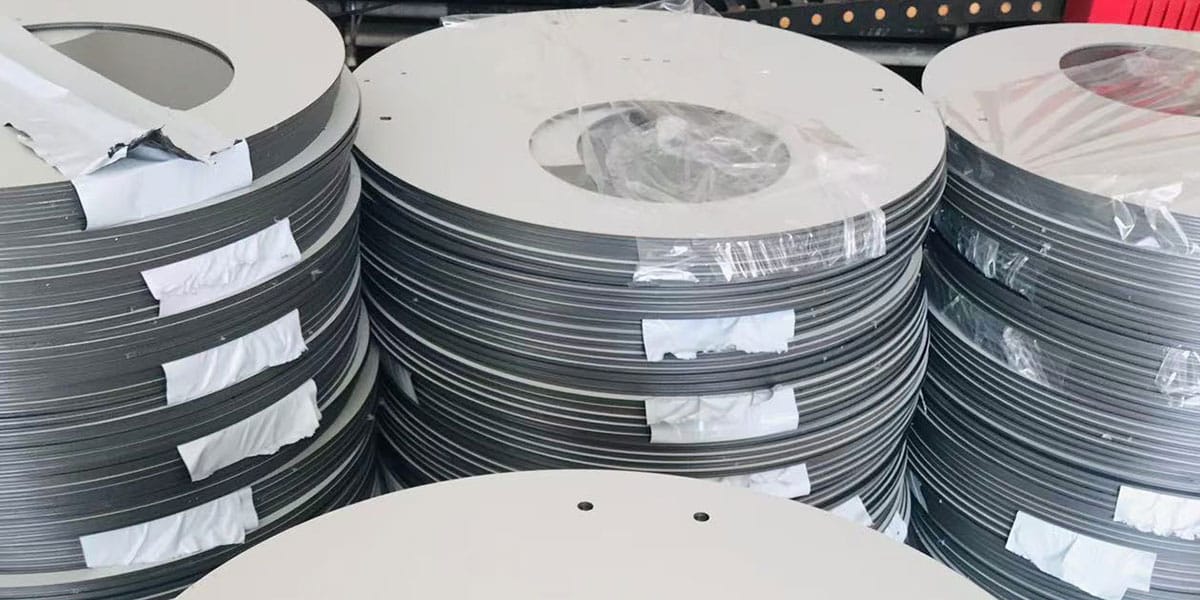
Aluminum Composite Panels
When you choose aluminum composite panels for your signage, you get a strong and reliable material. These panels are lightweight, so you can install them easily. They resist rust and corrosion, which means your sign will last longer outside. You also get great protection from UV rays and harsh weather. Modern aluminum composite panels use advanced coatings that keep colors bright and surfaces smooth. You can pick from many finishes, like metallic or printed patterns, to match your brand style.
Aluminum composite panels offer fire resistance and low maintenance.
They provide excellent adhesion for paints and graphics, so your designs stay sharp.
You can use them for both indoor and outdoor signs because they handle extreme weather well.
The quality of aluminum composite panels affects how long your sign looks new.
A table can help you compare common signage materials:
Material | Durability | Weather Resistance | Maintenance | Customization |
|---|---|---|---|---|
Aluminum Composite | High | Excellent | Low | High |
Acrylic | Medium | Good | Medium | High |
PVC | Medium | Moderate | Low | Medium |
Wood | Medium | Improved (treated) | Medium | Medium |
Coroplast | Low | Moderate | Low | Low |
Coatings & Durability
You want your sign to stay bright and readable for years. That is why protection is so important. Coatings on aluminum composite panels give you extra defense against scratches, fading, and pollution. New technologies add surface protection that blocks UV rays and stops bacteria from growing. Some panels even clean themselves when it rains, so you spend less time on upkeep.
Protection from weather and sun keeps your sign looking fresh.
Anti-scratch coatings prevent damage from daily contact.
Fire safety features add another layer of protection for your business.
Good adhesion between the panel and the coating means your paint quality stays high.
Tip: Always check for UV protection and fire safety ratings when you pick your panels.
You can trust aluminum composite panels to deliver strong protection, long life, and easy care. With the right surface protection and paint quality, your signage will stand out and last.
Custom Shapes & Flexibility
Cutting & Routing
You can make your signage stand out by choosing custom shapes. Aluminum composite panels are easy to cut and route. This means you can create almost any shape you want. You do not have to stick with rectangles or squares. You can ask your sign maker to use special machines to cut curves, circles, or even your logo shape. This process is called routing. It lets you add depth and layers to your sign. You can also make letters or symbols pop out from the background.
Tip: Try using layered panels for a 3D effect. This makes your sign more eye-catching.
A table can help you see the benefits of custom cutting and routing:
Feature | Benefit |
|---|---|
Unique shapes | Attract more attention |
Routed edges | Add depth and style |
Layered panels | Create a 3D look |
Logo cutouts | Show off your brand clearly |
Creative Signage
You can use creative applications of acps to make your business memorable. Custom designs let you match your sign to your brand’s personality. You might choose bold shapes, bright colors, or special finishes. Some businesses use panels to build signs that look like their products. Others use cutouts to frame windows or doors. You can even make signs that light up from behind for a glowing effect.
Use custom shapes to fit odd spaces or wrap around corners.
Try mixing materials, like metal and acrylic, for a modern look.
Add lighting for signs that stand out at night.
When you use creative ideas, your signage becomes more than just a label. It turns into a piece of art that draws people in and helps them remember your business.
Installation & Maintenance
Lightweight Benefits
Aluminum composite panels make your signage much easier to handle. You can lift and move these panels without heavy equipment. This lightweight feature helps you install signs in many interior spaces, such as offices, stores, and schools. You do not need to worry about damaging walls or ceilings during installation. The panels put less stress on mounting surfaces, which is important for older buildings or delicate interior finishes.
You can also change or update your signage quickly. If you want to refresh your interior look, you can remove the panels and put up new ones with little effort. This flexibility saves you time and money. Lightweight panels also make it safer for workers during installation. You lower the risk of injury because the panels are easy to carry and position.
Tip: Choose lightweight panels for large interior signage projects to reduce labor costs and speed up installation.
Easy Installation
You can achieve easy installation by following a few smart steps. Modern signage projects use advanced mounting hardware, such as articulating mounts and quick-release systems. These tools let you adjust your sign with precision and make future maintenance simple. Professional installers use power tools like hammer drills and torque-limiting screwdrivers to secure your signage safely in any interior setting.
Before you start, you should use laser levels and digital angle finders. These devices help you align your signage perfectly, which is important for multi-panel displays or video walls in interior spaces. Installers also check the walls with electronic stud finders and wall scanners. This step prevents mistakes and ensures your signage stays secure.
A good installation plan includes:
Site assessment with tools like LiDAR mapping for accurate measurements.
Structural checks to make sure the interior walls can support your signage.
Cable management systems to keep wires neat and hidden.
Safety gear, such as gloves and eye protection, to follow OSHA rules.
Regulatory checks to meet all legal standards before you begin.
You can avoid costly errors by using detailed installation plans. These plans help you finish your interior signage project on time and with fewer problems. If you want more installation tips, talk to a professional who knows the latest tools and methods.
Digital & Dynamic Signage
LED Integration
You can make your signage brighter and more energy-efficient by using LED technology. LEDs use electroluminescence to produce light, which means they shine brightly while using less power. Modern LED signs last much longer than traditional signs. For example, LED signs can work up to 100,000 hours, while older signs last about 30,000 hours. This long lifespan means you spend less time and money on maintenance.
LEDs also give you more control over your sign’s brightness. Adaptive technology lets your sign adjust to different lighting conditions, so your message stays clear even in direct sunlight. You can update your content in real time using cloud-based systems. This makes it easy to share new promotions or important information quickly.
Here is a quick comparison:
Feature | Traditional Signage | Modern LED Signage |
|---|---|---|
Lifespan | 30,000 hours | Up to 100,000 hours |
Energy Consumption | High | Up to 70% lower energy use |
Brightness Control | Fixed | Adaptive brightness technology |
Content Flexibility | Static | AI-driven real-time updates |
Maintenance | Frequent | Minimal maintenance required |
LED signs also come in many shapes and sizes. You can use flexible or transparent panels for creative designs. Smart LED signs can even use sensors to change content based on the environment. These features make LED signage a smart choice for businesses that want to stand out and save on energy costs.
Video Walls
Video walls let you create large, eye-catching displays by combining multiple screens. You can use them to show videos, animations, or changing messages. This dynamic approach grabs attention much better than static signs. Studies show that digital displays attract 400% more attention than traditional signs. Retail stores using digital signage see a 24% increase in foot traffic and a 46% boost in customer satisfaction.
Many big brands use video walls to engage customers. For example:
McDonald’s uses digital kiosks to speed up service and improve accuracy.
Adidas creates buzz in pop-up stores with digital displays.
Sephora connects online and in-store shopping with digital signage.
Tesla uses interactive screens to educate visitors in showrooms.
Field experiments in grocery stores found that video walls can increase sales of products placed far from the screens. This means your dynamic signage can influence customers even if your products are not nearby. Video walls help you share important messages, promote new items, and create a memorable experience for everyone who visits your business.
Testing & Feedback
Proofs
You need to check your signage design before final production. Proofs help you see how your sign will look and work in real life. This step gives you a chance to catch mistakes and make changes early. Validation is a forward-looking process that uses documented evidence to make sure your signage will meet quality standards every time. You can use statistical tools like Design of Experiments and control charts to test your design. These tools help you find problems and fix them before your sign goes up.
A strong validation process often includes a team of experts. Quality assurance specialists, engineers, and IT professionals work together to set up tests, review results, and write reports. They use risk-based approaches to focus on the most important parts of your signage. Good documentation keeps track of test conditions, acceptance rules, and results. This process helps you avoid surprises and ensures your signage stays consistent and reliable.
Tip: Always ask for a physical or digital proof before final approval. This step is key for proper planning and quality control.
Stakeholder Input
You can improve your signage project by listening to feedback from everyone involved. Stakeholder input means you gather ideas and concerns from people who will use or see your sign. This group can include business owners, employees, customers, and even local community members. When you collect feedback from different groups, you find out what matters most to them.
A case study showed that using models to map out stakeholder opinions helped project leaders understand both direct and indirect effects of their choices. This approach made it easier to spot problems, reduce conflicts, and make better decisions. Traditional methods often miss important feedback, but systematic engagement helps you avoid mistakes and build support for your project. By linking stakeholder input to your decision-making, you create signage that works well for everyone.
Note: Good planning includes time for feedback and review. This step helps you avoid costly changes later and leads to better results.
You can create standout aluminium composite panel signage by following a few key tips:
Keep your design simple and bold.
Use high-contrast colors and clear fonts.
Choose durable materials and finishes.
Plan for easy installation and maintenance.
Thoughtful choices help your signage last longer and look better. Start your design draft today or talk to a signage expert for extra guidance. Your brand deserves to shine!
FAQ
How long does aluminium composite panel signage last?
You can expect your aluminium composite panel signage to last 7–10 years outdoors. Indoors, it often lasts even longer. The panels resist rust, fading, and weather damage, so your sign stays bright and strong.
How do you clean aluminium composite panel signage?
Use a soft cloth and mild soap with water. Gently wipe the surface to remove dirt or dust. Avoid harsh chemicals or abrasive pads. Regular cleaning keeps your sign looking new.
Can you customize the shape and size of your signage?
Yes! You can cut aluminium composite panels into almost any shape or size. Sign makers use special tools to create unique designs, logos, or letters that fit your brand.
Is aluminium composite panel signage expensive?
Aluminium composite panel signage costs more than basic plastic signs, but you save money over time. The panels last longer and need less maintenance. You get good value for your investment.